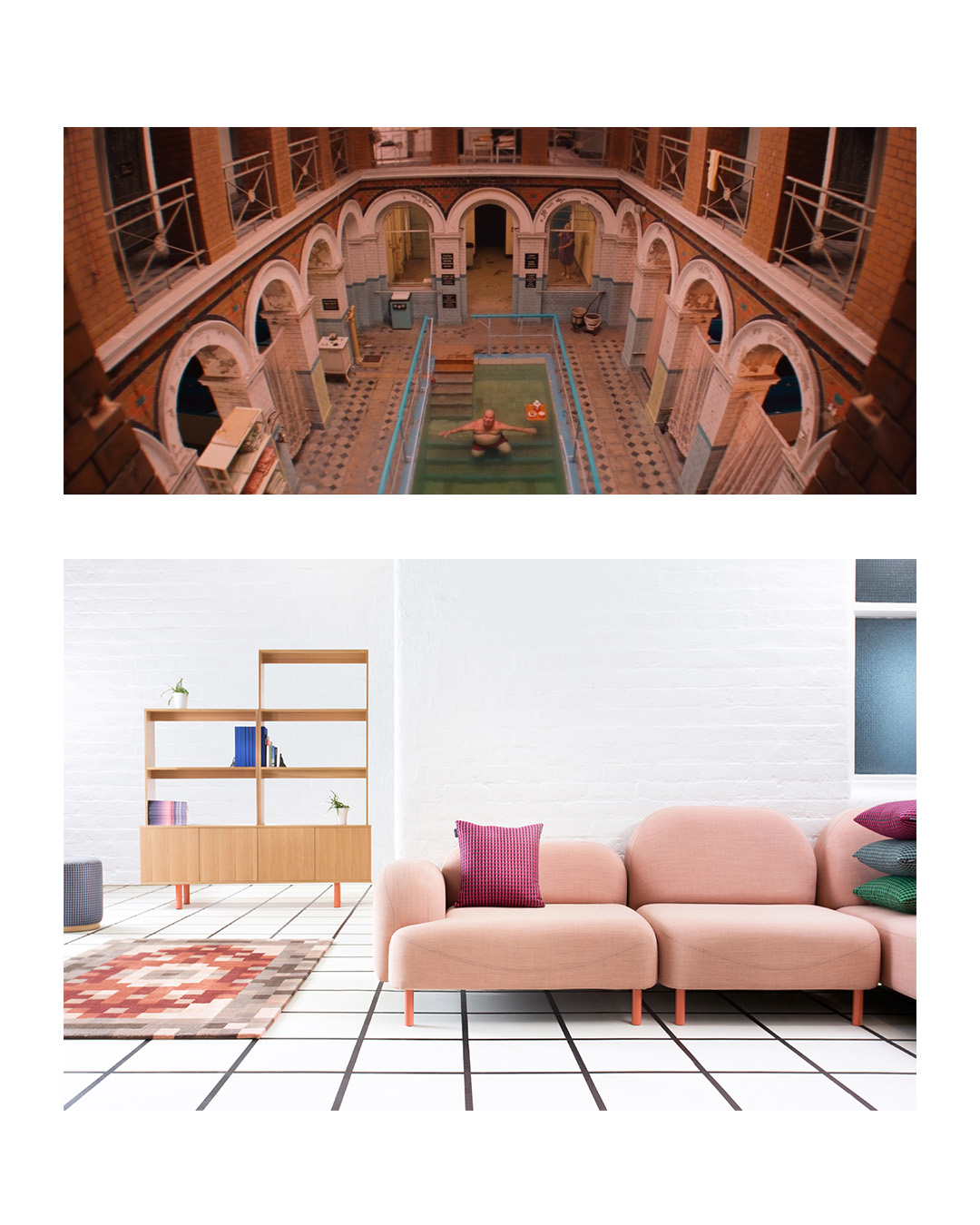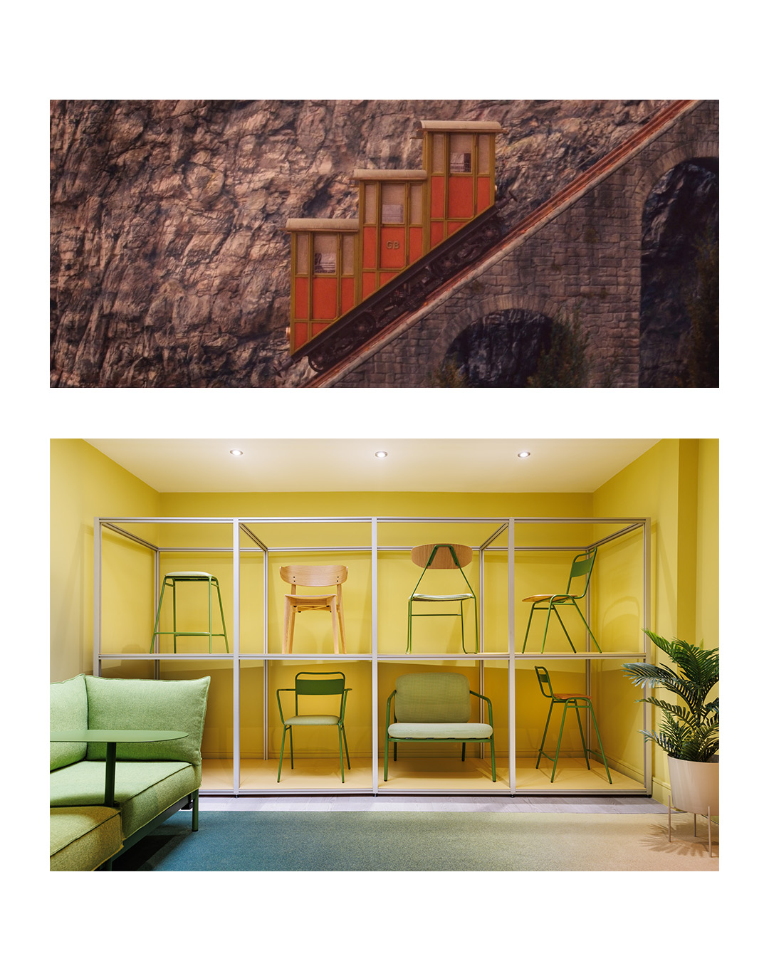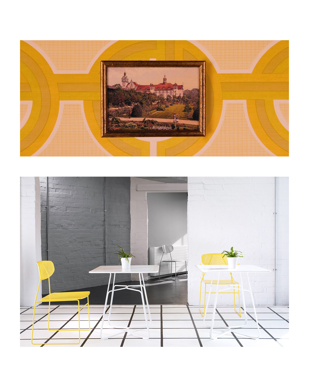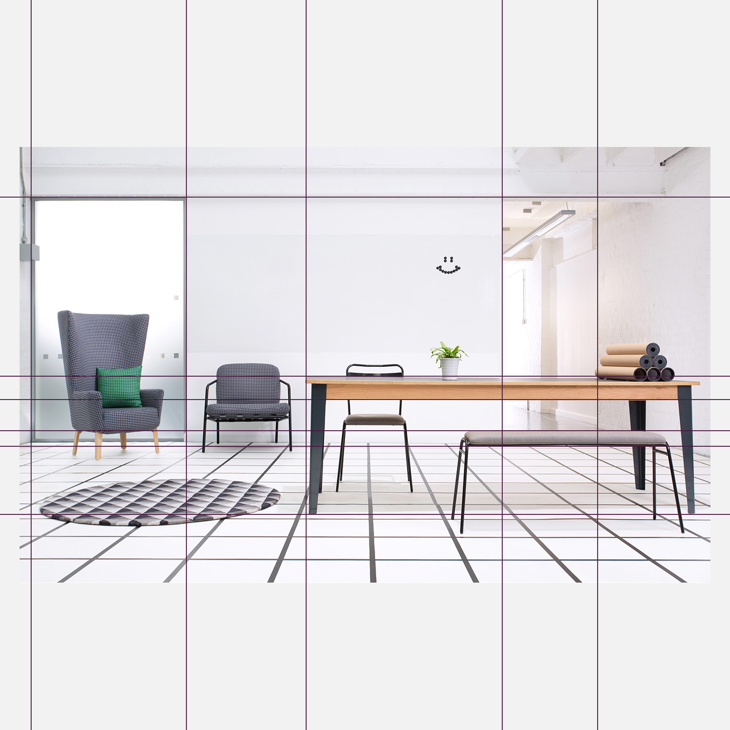
For our latest creative exploration, we turned the lens inward, channeling the meticulous, whimsical world of film director Wes Anderson. Known for center-weighted compositions, vivid pastel palettes, and a touch of deadpan theatricality, it’s an art direction style that speaks directly to how we think about furniture.
Working alongside photographer Mark Slater, the brief was simple in theory, yet demanding in execution: dead-pan, straight-on shots, razor-sharp symmetry, and deep spatial perspective. Set against a high-contrast grid floor—a nod to classic sci-fi cinema—we let the furniture take center stage.
The result is a visual study in proportion and character. Bold, British design presented with surgical precision, a dash of humor, and zero wasted space.